Accademia Carrara di Bergamo
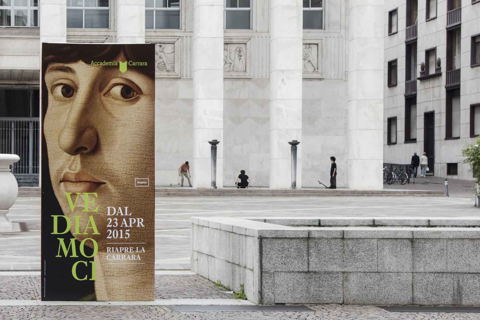
The Accademia Carrara in Bergamo is internationally renowned for its Renaissance masterpieces. In April 2015, after six years of renovation work the pinacotheca reopened its doors. In conjunction with the reopening Lupo Burtscher conceptualized and designed the museum’s new visual identity.
A symbol, a logotype, one colour and two typefaces
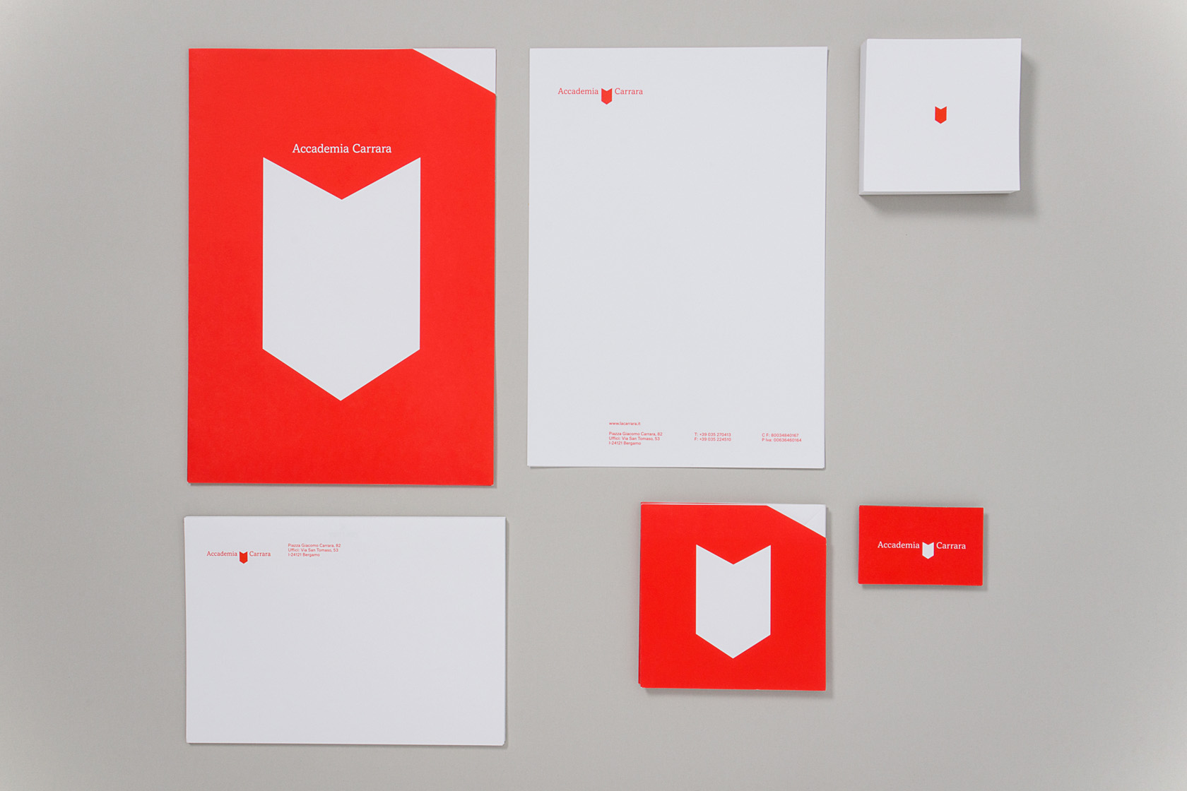
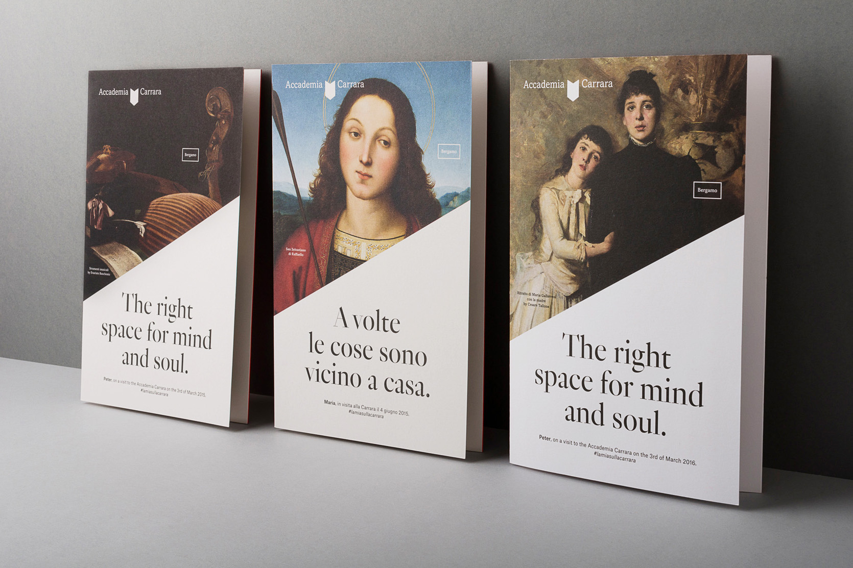
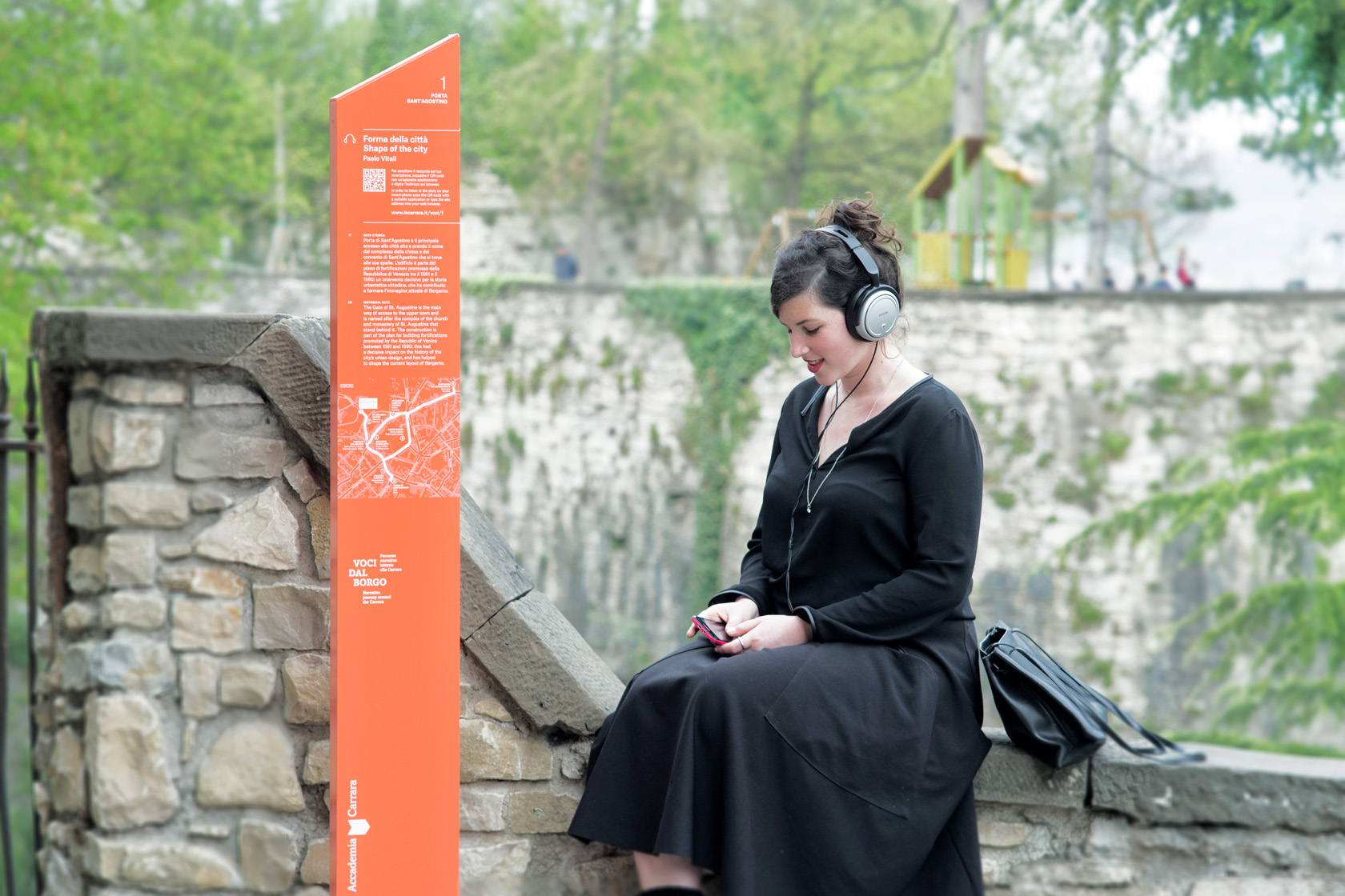
The new logo of the Accademia Carrara consists of three elements: a symbol, a typeface and a graphic element highlighting the museum’s location. The symbol features on publicity materials in various dimensions, colours and positions. As a distinct element it also serves as a surface for the communication of content and as a pattern for special printed materials. The typographic element “Bergamo” is used as a flexible multipurpose element. Pantone Bright Red, the institution’s colour identity is used for external communications. Additional colours are used for exhibitions and events.
The museum’s image is defined by two typefaces: Amasis by Ron Carpenter for headlines and Atlas Grotesk by Atelier Carvalho Bernau for the body text. When works from the pinacotheca are used in publicity materials, details of the author, title and year are given as a centred caption.


