Literatur Lana
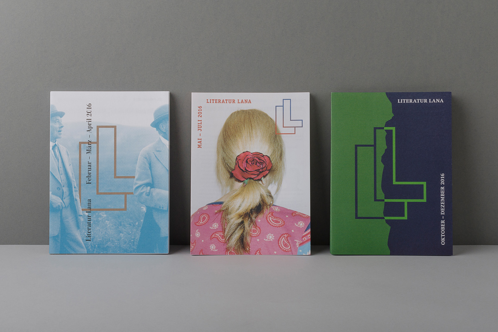
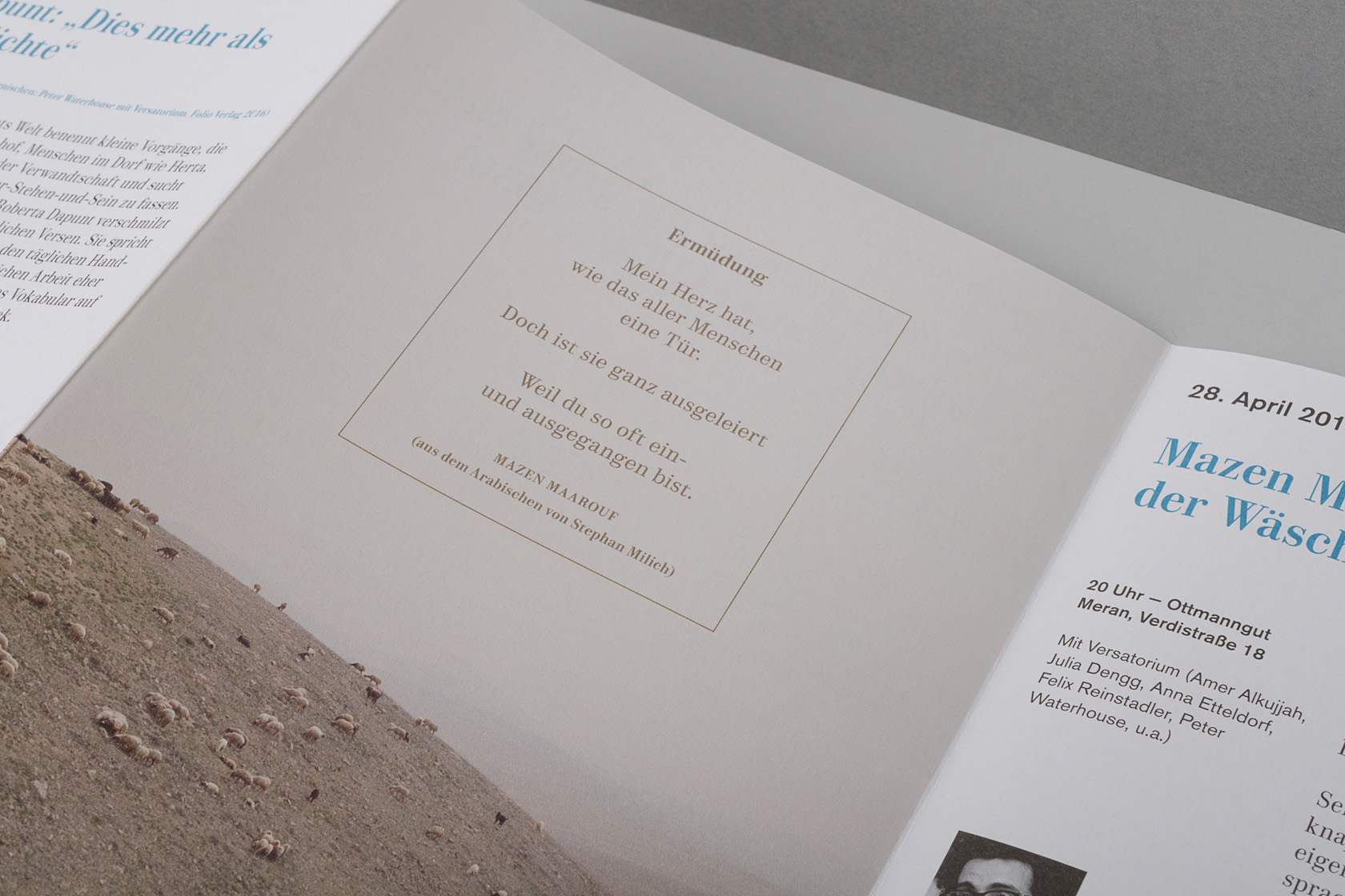
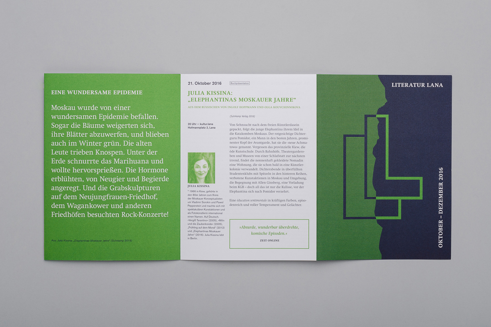
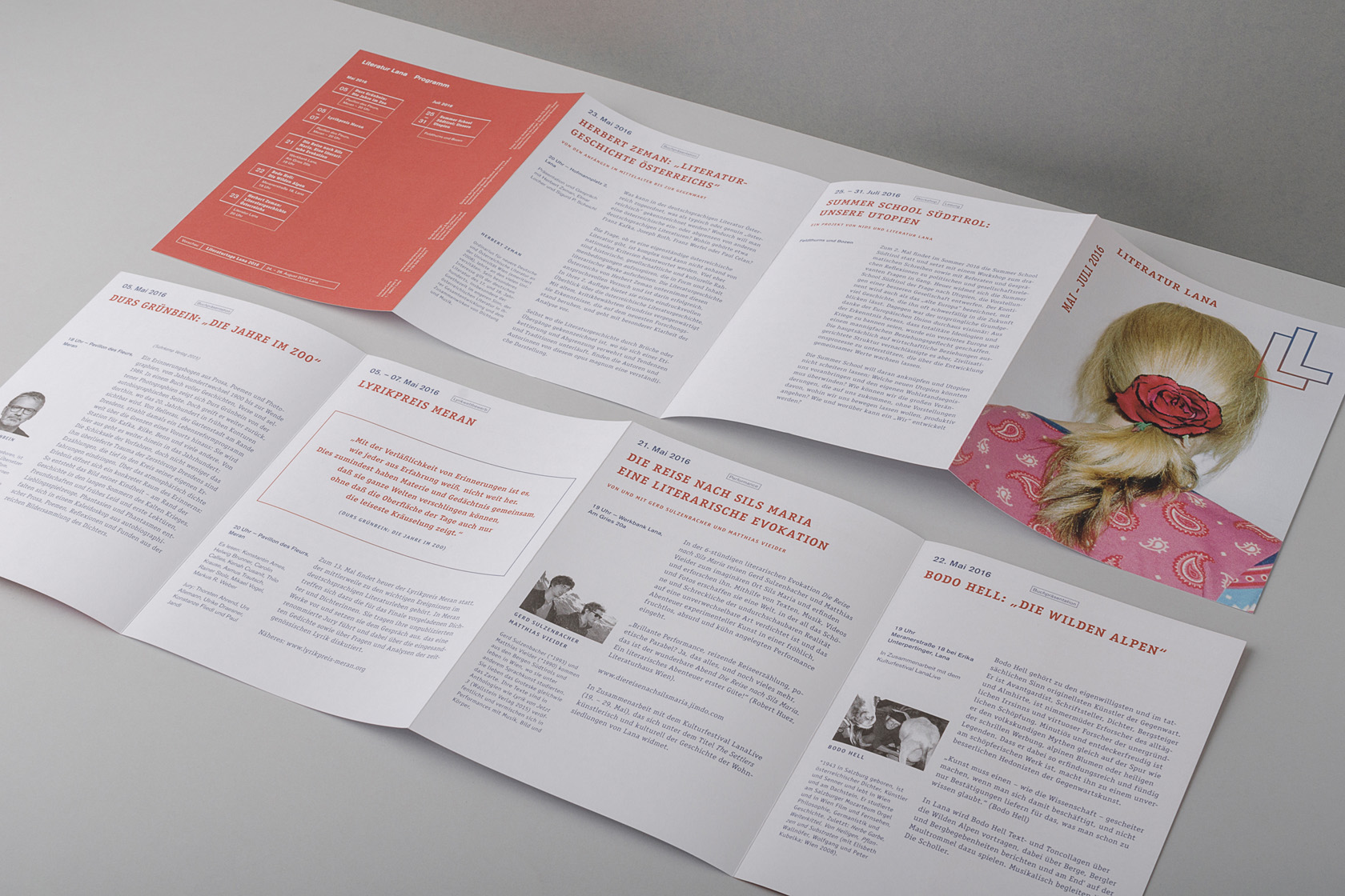
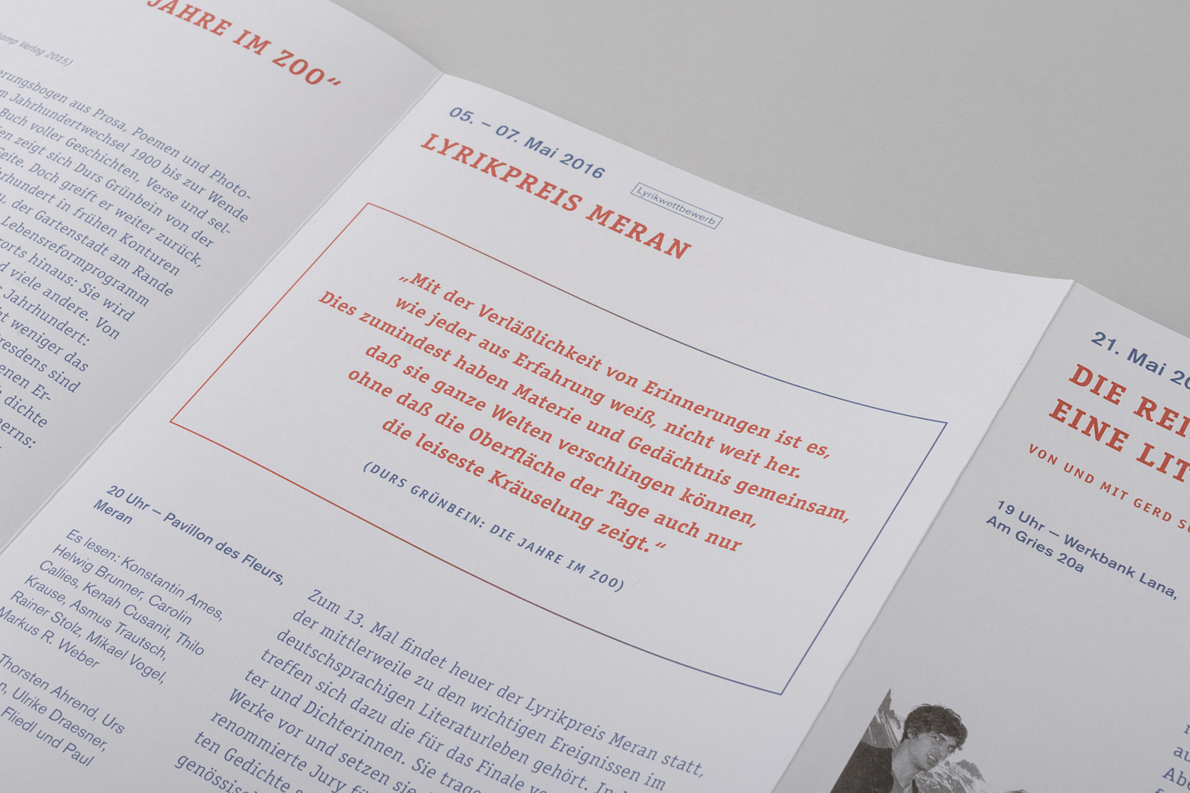
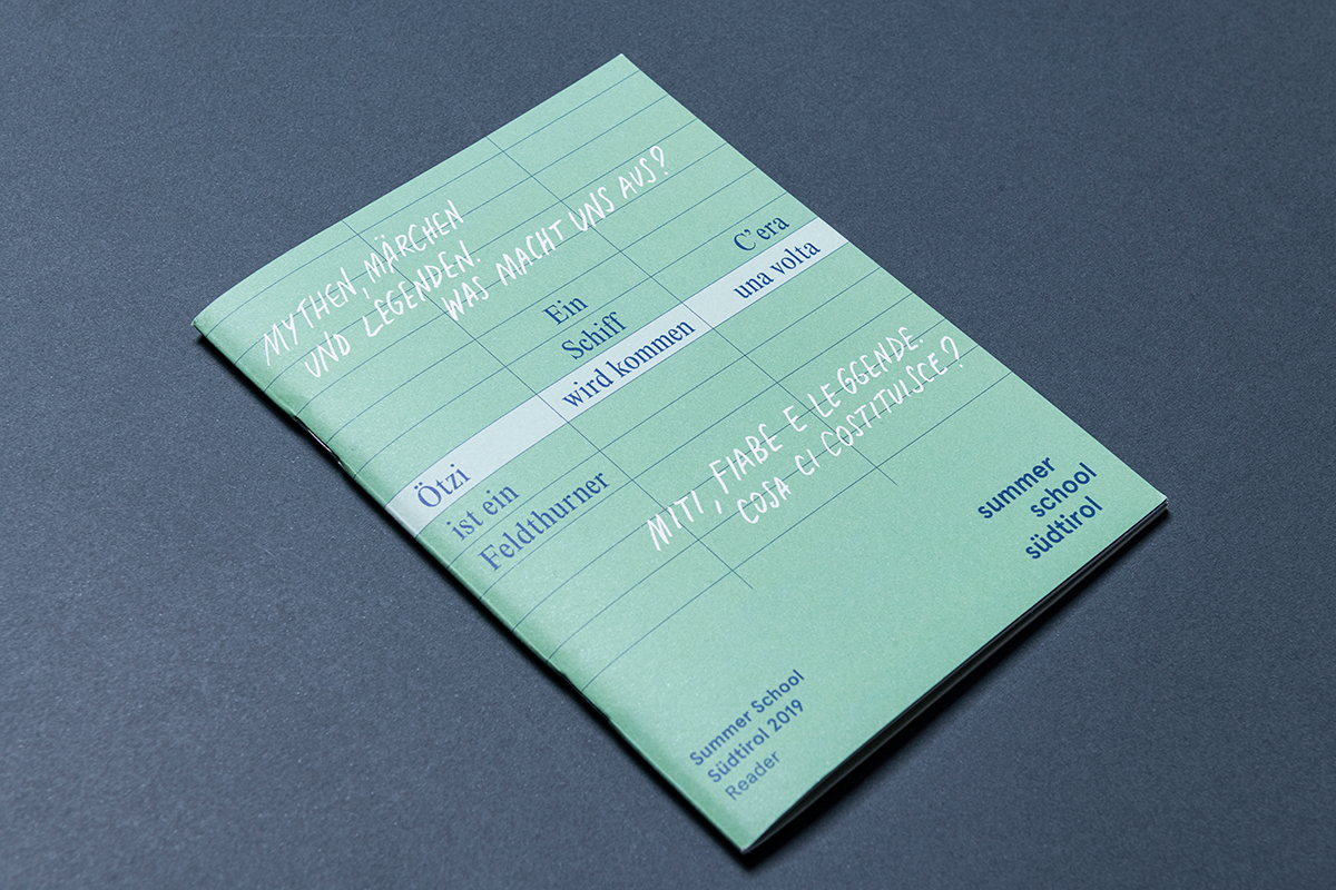
Each edition of Literatur Lana’s visual identity comes across as different and distinctive. The single recognisable feature is its logo: Literatur Lana should be able to communicate its programme with as much freedom as possible, bringing a diversity of languages and world-wide literature to South Tyrol. A logo, together with a type-face concept, form the basic framework, which allows a great deal of creative freedom, while conveying a coherent visual image to the outside world.
The logo
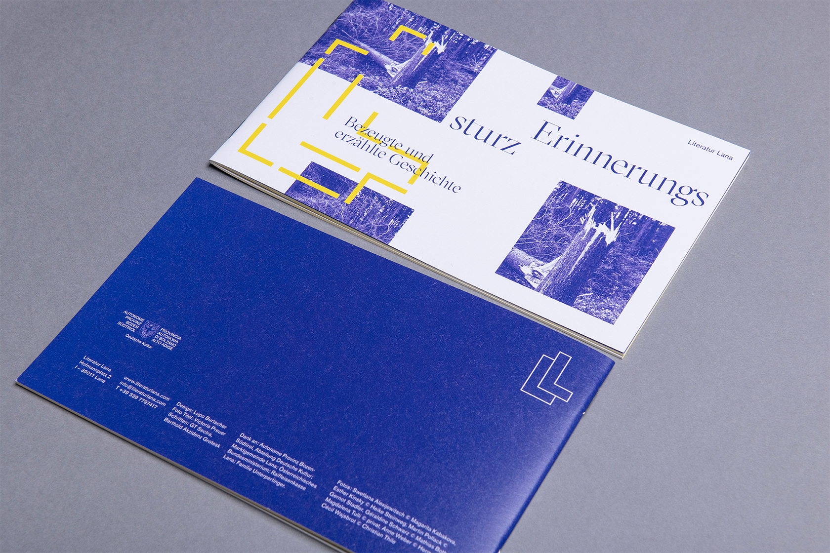
Literatur Lana is a meeting place for authors and their poetic languages, who are based in Lana and its neighboring regions. The two Ls in the logo recall the What and the Where, tightly knit together and yet different in form – and flexible The logo allows for countless variations, from an empty form to design with photos, patterns, text or a mutual overlapping of these themes.


